Canvas Scaling and Smoothing Tricks
I love HTML Canvas. I even wrote a book about it once. Canvas is good drawing API and it runs everywhere. However, despite the magic that is the Canvas API, it can still be tricky to use when it interacts with CSS. I often have people ask me how to make their canvas fill the screen, or resize with the window, or to have a fixed aspect ratio but still scale to fit inside the window without overlap. All of these require understanding some internal details about how Canvas works. So let’s dive in.
Canvas is a replaced element in HTML. This means it is a rectangle with a fixed internal size. Essentially the browser treats a Canvas element as an Image. This means that some CSS styles meant for images also work for Canvas! You can tell the canvas to be a certain pixel size and use CSS to change its visual size. For example you could make a canvas that is 256x256 pixels, then scale it up to be 2560x2560. The canvas doesn’t know the difference; it draws into its buffer just like it was an image.
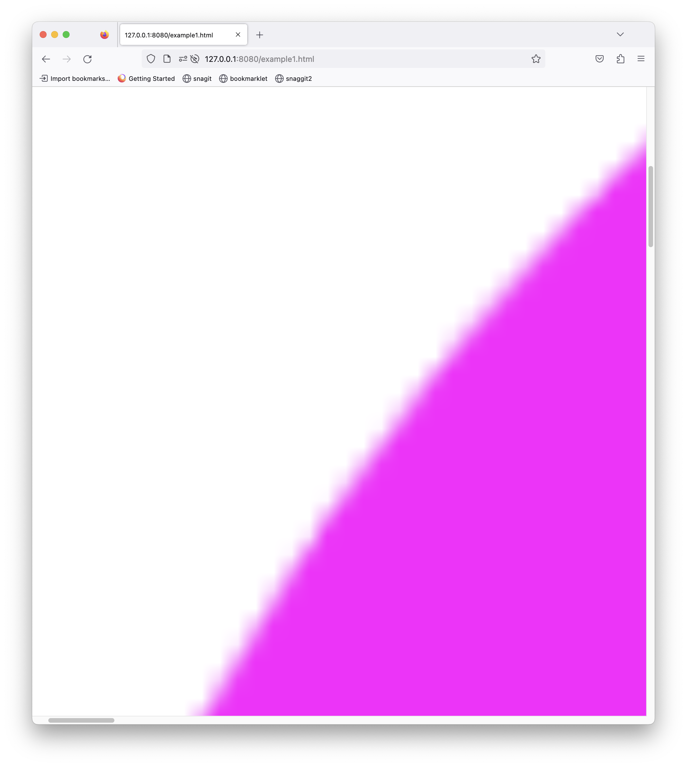
In the case below a 256px magenta circle on a white square canvas that is resized to be 8000 pixels across. The height is auto so it will maintain the same aspect ratio, just like an image.
<canvas width="256" height="256"></canvas>
<style type='text/css'>
     canvas {
        width: 8000px
     height: auto
  }
</style>
A really big image
Adapting for High DPI Screens
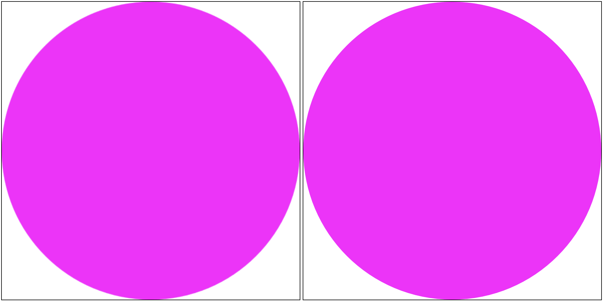
Now let’s consider HiDPI. Suppose you want a 500 x 500 pixels canvas, but if the viewer has a display with 2x HiDPI support then it should scale it up to look the same, but sharper. We can do this by increasing the pixels in the canvas and using CSS to constrain it back to its 500 x 500 pixel size. Remember that in CSS pixels are virtual pixels. They are scaled by the browser automatically. So on a 2x screen we’d want the canvas to be 1000x1000 image pixels but scaled back to 500x500 virtual pixels, which will be scaled back up by the browser to 1000x1000 physical screen pixels.
<canvas id="can" width="1000" height="1000"></canvas>
<style type='text/css'>
    canvas {
        width: 500px;
        height: auto;
    }
</style>
<script type='javascript'>
    const ctx = document.getElementById('can')
    ctx.fillStyle = 'red'
    ctx.beginPath()
    ctx.arc(250,250,250,0,Math.PI*2)
    ctx.fill()
</script>
Left is without the fix, right is with the fix.
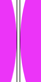
Notice in this zoom how the pixels are sharper in lower image
Of course the ratio might not be 2x. There are some mobile devices with 3x screens. Also, the canvas now thinks it has 1000px of space, but if your drawing code assumes 500px it will will only draw in the upper left corner of the canvas. Let’s scale the size of the canvas to use the real device’s DPI in code, and then reverse the scale for drawing the circle. The property window.devicePixelRatio will give us the correct scaling factor.
<canvas id="can" width="500" height="500"></canvas>
<script type='javascript'>
    const canvas = document.getElementById('can')

    let dpi = window.devicePixelRatio
    const WIDTH = 500
    const HEIGHT = 500
    canvas.width = WIDTH*dpi
    canvas.height = HEIGHT*dpi
    canvas.style.width = `${WIDTH}px`
    canvas.style.width = `${HEIGHT}px`
    const ctx = canvas.getContext('2d')
    ctx.save()
    ctx.scale(dpi,dpi)
    ctx.fillStyle = 'white'
    ctx.fillRect(0,0,WIDTH,HEIGHT)
    ctx.beginPath()
    ctx.arc(WIDTH/2,HEIGHT/2, WIDTH/2,0, Math.PI*2)
    ctx.fillStyle = 'magenta'
    ctx.fill()
    ctx.restore()
</script>
Preserving Chonky Pixels
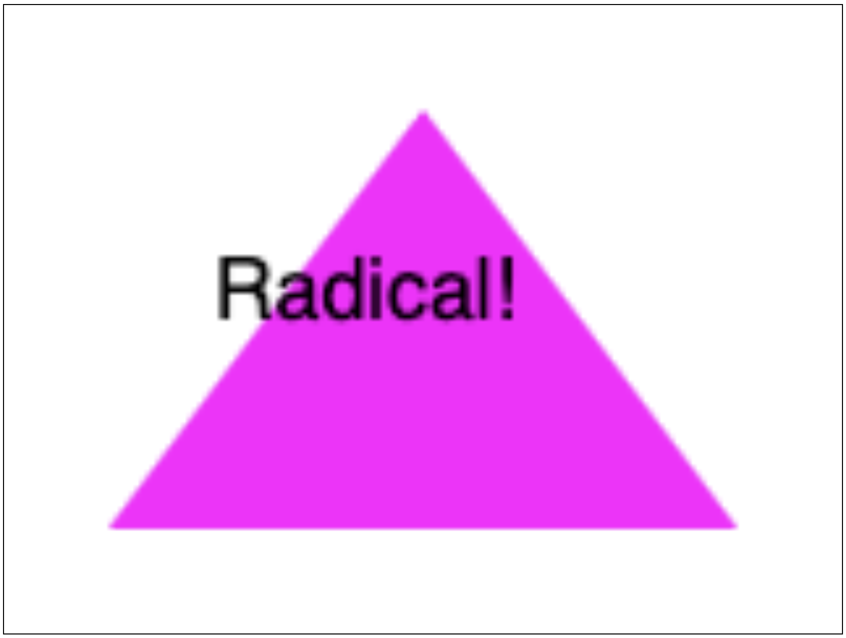
We’ve seen that scaling up a canvas to handle high resolution is easy. But what if we need the opposite? Suppose we were making a game with retro-style pixel art then we want to see the chunky pixels. Unfortunately if we just scale it up the pixels get blurry, like this:
To fix this we need to tell the browser to not smooth the pixels. CSS already has a property for this, image-rendering: pixelated and it works for canvases too.
With that one css property it looks like this:
Note that if you draw scaled images inside the canvas they may still be smoothed. You can fix this by setting imageSmoothingDisabled:true on the drawing context

Big but not too big
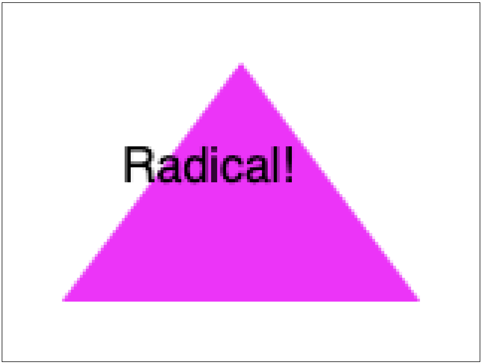
Now that we have a retro game canvas, say a 160 x 120 pixel screen, we might want it to grow as big as possible to fill the extra space on page. We could use width:100% but the bottom might get cut off if the window is wide but short. Setting both width and height to 100% would make it fit but stretch and squish the pixels. Instead we want the canvas to be as big as possible while maintaining it’s aspect ratio, but not so big that any part of it is hidden. This turns out to be a common need for images as well, so there’s already a CSS property that does it: object-fit. With object-fit:contain the canvas will shrink to be completely contained within the styled size.
In this example a 160x120px canvas is stretched to 500x500.
canvas {
  width:500px;
  height:500px;
  image-rendering: pixelated;
  background-color: black;
}
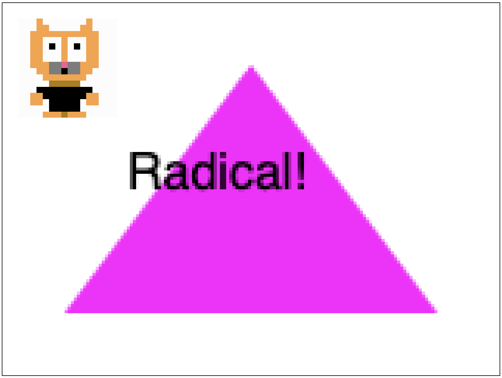
If we set object-fit to contain then we get this, with black bars (the background of the canvas) filling the extra space.
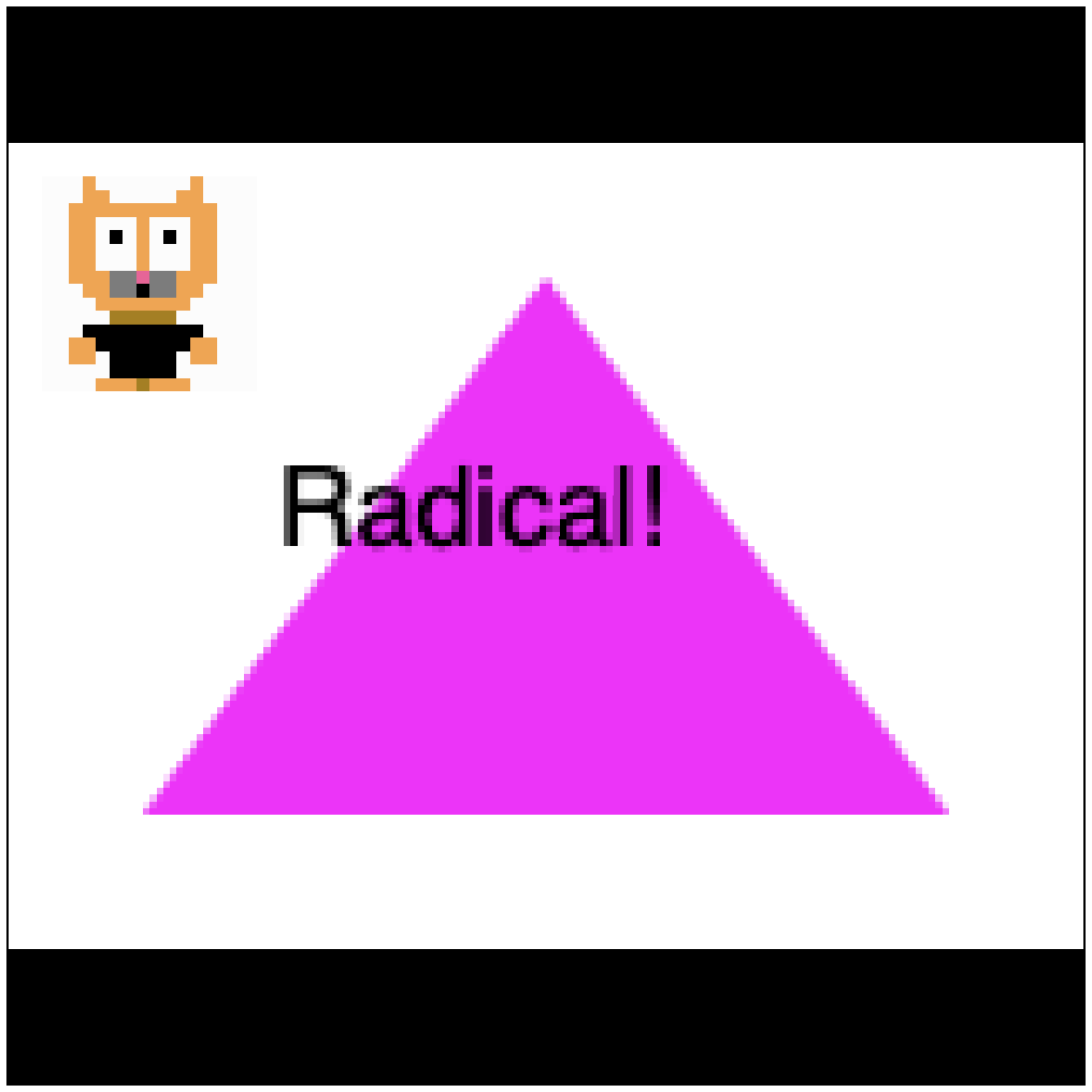
And if we set object-fit to cover it will expand to fill all space, but possibly crop the edges off. Not good for our retro game but it could be useful for other cases where you don't know the rendered size until the page is loaded.
The object-fit - CSS: Cascading Style Sheets | MDN specs page describes all of the possible values. This css property is really for images, but remember: anything an image can do a canvas can do better!
canvas to fill the screen
So far we have used a canvas with a fixed size. We might scale the size up, but it has a definite size that doesn’t depend on the size of the browser window or any content next to the canvas. Sometimes we do want the canvas to adapt to its surroundings. Consider a drawing tool. It needs to resize when the user resizes the window. We could give the canvas a width and height of 100%, which would make it stretch to fill the available space, but, just like an image, that no longer preserves the aspect ratio. The pixels would get squished. Instead we need the canvas to change both its layout (css pixels) and its drawing surface (image pixels) to handle the current conditions. To do this we’ll need some code.
First we need to figure out how to get anything to fill the page. Let’s start with a div wrapping a canvas. Setting the width and height of the div to 100% does this:
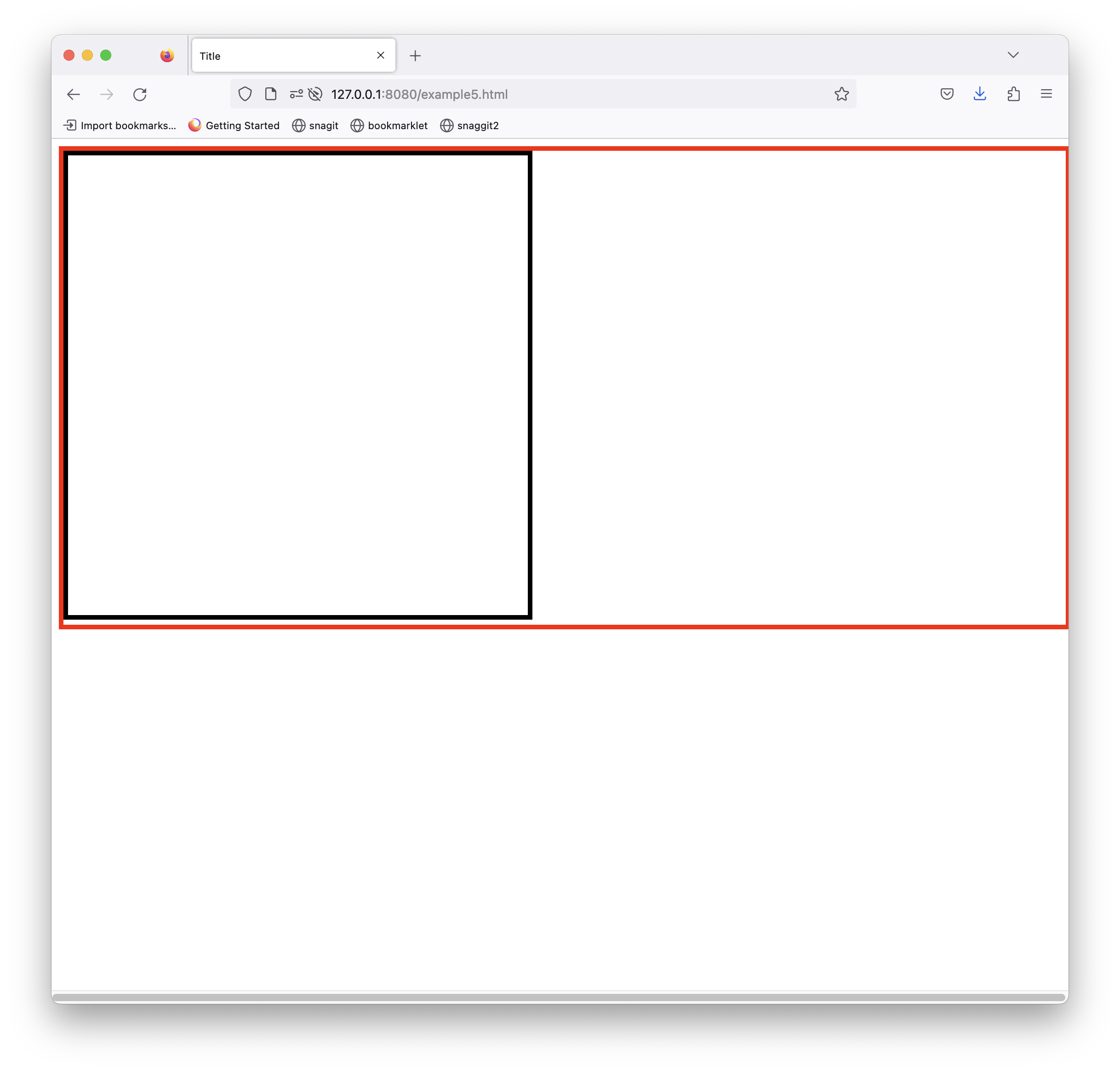
Hmm. Not what we want. The problem is that the body element is special. It always takes up the full width of the window’s viewport, but the height depends on the content. What we want is for height to be exactly 100% of the viewport’s height. Enter CSS vh and vw units. Setting the div's size like this
div {
    width: 100vw;
    height: 100vh;
}
gives us this
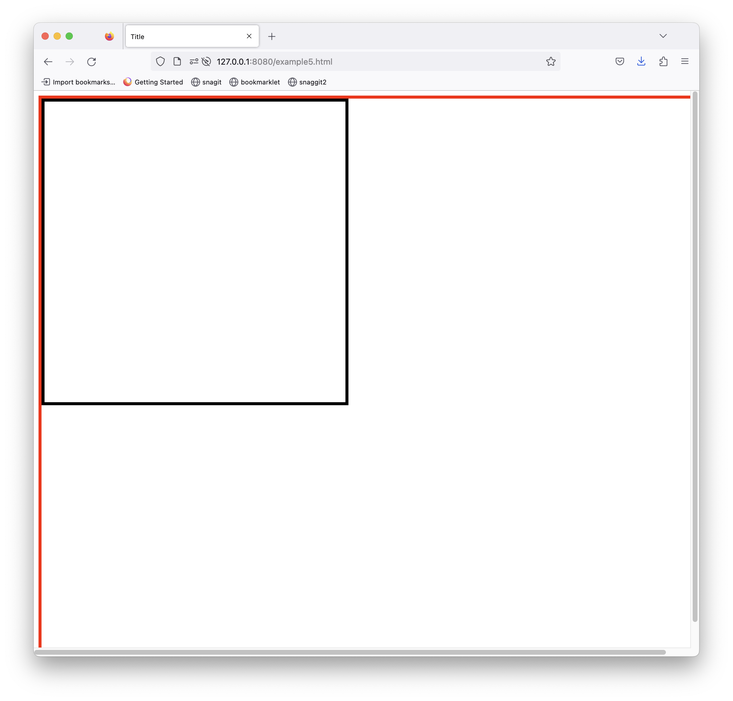
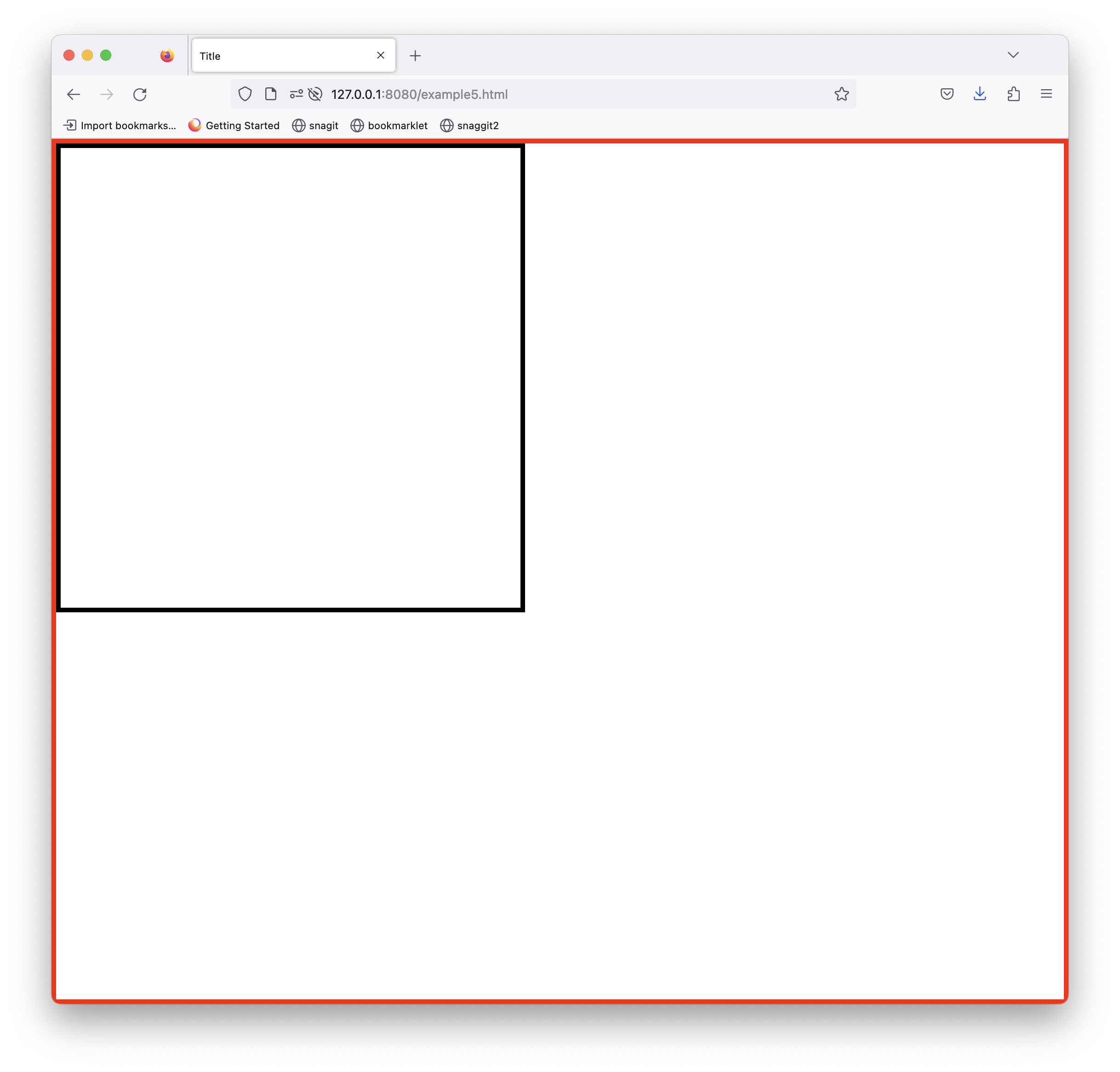
Depending on your browser you might get some scroll bars. This just means there’s extra space we need to get rid of. Set the padding and margins to 0 for both the div and body, and set box-sizing to border-box to account for the 5px colored borders. Now we get this, and resizes properly with the window.
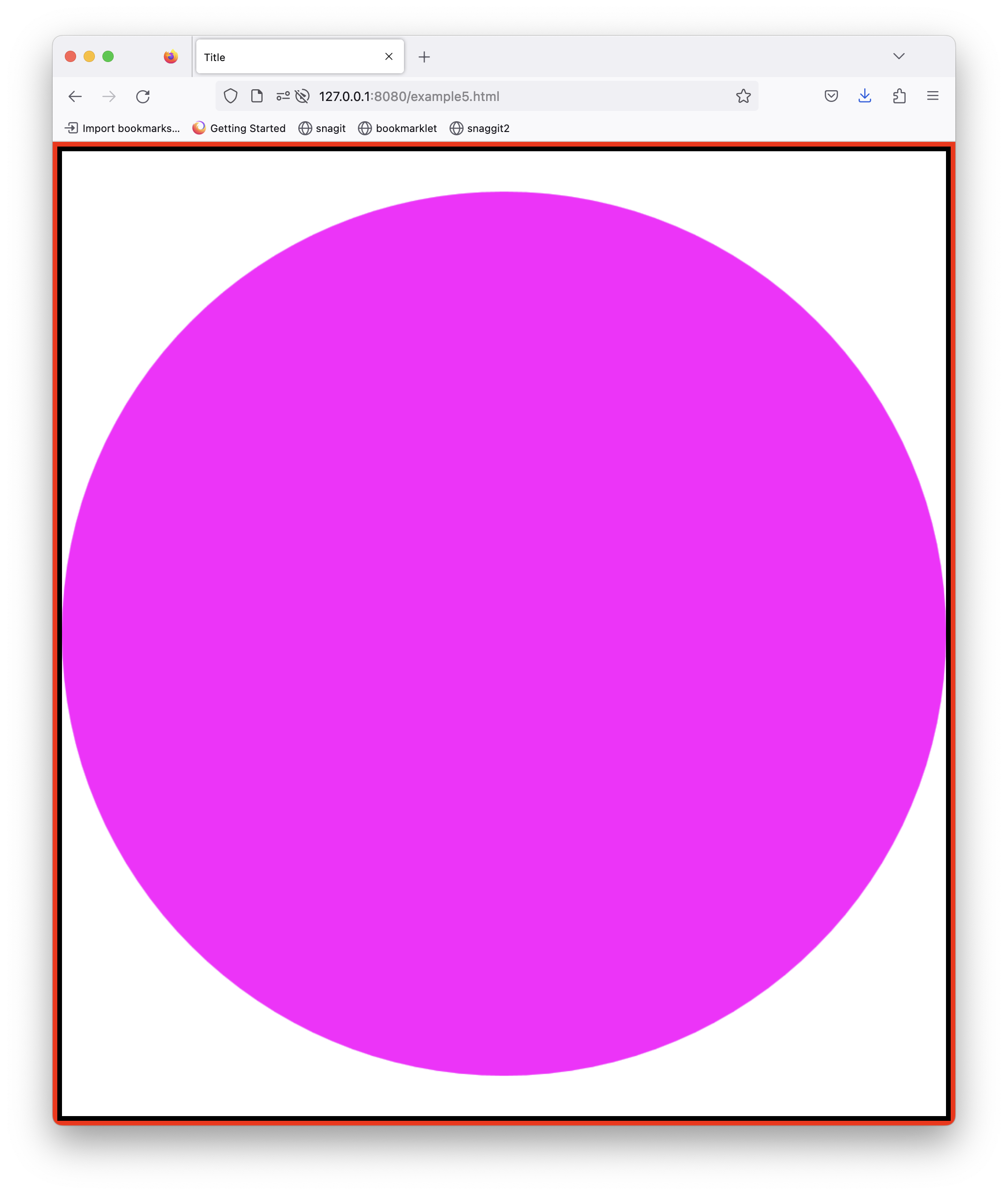
Now that the div is sizing properly, we just need to update the canvas itself when the window resized. Again we will use a little bit of code. On every size it will set the canvas size to the size of the div, minus the borders. Depending on your browser you might also need to set overflow: hidden; on the body element.
    function calcCanvasSize() {
        // get the wrapper size
        const wrapper = document.getElementById('wrapper')
        let rect = wrapper.getBoundingClientRect()
        const can = document.getElementById('can')
        // set the canvas size to wrapper, minus the 5px borders
        can.width = rect.width-5*4
        can.height = rect.height-5*4
        const WIDTH = can.width
        const HEIGHT = can.height
        // redraw
        const ctx = can.getContext('2d')
        ctx.fillStyle = 'white'
        ctx.fillRect(0,0,WIDTH,HEIGHT)
        ctx.beginPath()
        ctx.arc(WIDTH/2,HEIGHT/2, WIDTH/2,0, Math.PI*2)
        ctx.fillStyle = 'magenta'
        ctx.fill()
    }
    calcCanvasSize()
    window.addEventListener('resize',calcCanvasSize)
And now we get a beautifully resizing canvas.
Conclusion
I hope today you've seen how easy it is to style the canvas to different uses. As browsers introduce more css properties for images, almost all of them will work for canvas elements. Go Canvas!
Code for everything in this blog is available on this git repo.
Posted April 15th, 2023
Tagged: canvas